


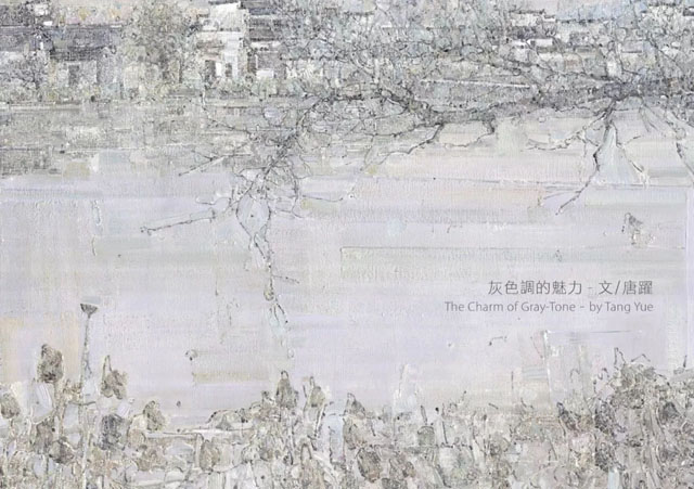
灰色調(diào)的魅力
唐 躍/安徽省文聯(lián)副主席
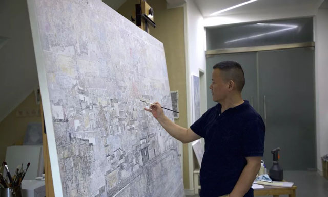
有一種感覺,郭凱的油畫越畫越灰了。
我沒有接觸過上個世紀(jì)的郭凱,只是很有限地接觸到他早先的作品,比如1993年到婺源曉起后的創(chuàng)作和1996年在中央美院進(jìn)修期間的創(chuàng)作。按照殷雙喜先生的說法,郭凱那時(shí)的作品用色厚重,有些拘謹(jǐn)和過于理性。但是,沒過多久,他的用色感性起來,逐漸走向平淡走向松弛。這個轉(zhuǎn)變,也就是越畫越灰的過程。
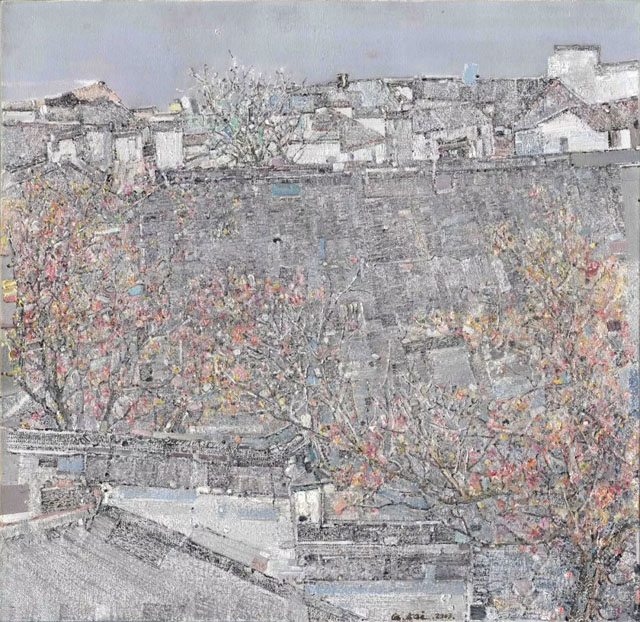
說是越畫越灰,其實(shí)是指郭凱對于灰色的掌控越來越得心應(yīng)手。郭凱早年的厚重和拘謹(jǐn)只是相對后來的輕盈和從容,他的用色沒有遵循寫實(shí)原則和客觀物象的色彩屬性。如《曉起》,畫面色相是灰性的,是低明度和低純度的,瀰漫著靜謐的氣氛和迷蒙的趣味。不過,從形而下的灰色運(yùn)用轉(zhuǎn)向形而上的灰色調(diào)表現(xiàn),用灰色調(diào)大幅籠罩畫面,造就了如夢如幻、如泣如訴的詩意質(zhì)量,是21世紀(jì)以來的事情。
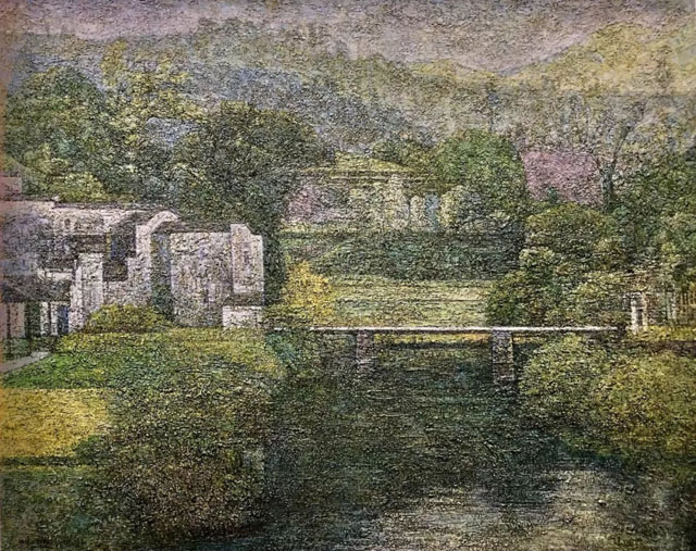
曉起 Xiaoqi
1998, 120 x 150 cm
油彩布面 Oil on Canvas
形而下的灰色運(yùn)用,是指把灰色作為多種色彩中的一種,參與描繪物件的形體塑造;甚至在畫面上用以表現(xiàn)明暗對比,在結(jié)構(gòu)關(guān)係上發(fā)揮過渡和轉(zhuǎn)折的作用,或用以表現(xiàn)冷暖對比和補(bǔ)色效果,降低色彩的明度和純度,在色彩關(guān)係上發(fā)揮協(xié)調(diào)和融合作用。此時(shí)的灰色運(yùn)用仍然帶有工具的性質(zhì),雖然不再滿足於扮演塑造某個形體的灰色面的角色,卻還是作為一種色彩參與著畫面造型。20世紀(jì)的郭凱在用色上處於摸索階段,並不拘泥於寫實(shí),也沒有達(dá)到主觀化色彩的高度自覺。那時(shí)的灰色運(yùn)用頗有些半推半就,一方面對作品的調(diào)性、趣味發(fā)生影響,就像1993年第一次前往曉起的創(chuàng)作;另一方面,服務(wù)於形體塑造的灰色塊面依然清晰可見,就像1996年在中央美院進(jìn)修期間所畫的皖南民居。21世紀(jì)以來,郭凱開始追求灰色的本質(zhì)的、內(nèi)在的東西,使灰色成為負(fù)載著畫家精神和情感的色彩語言,成為了一種調(diào)性,一種意味,一種象徵。如此一來,形而上的或者說主觀表現(xiàn)性的「灰色調(diào)」應(yīng)運(yùn)而生。
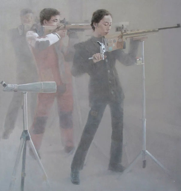
心繫靶心之一 Eye of the Target I
2005, 180 x 170 cm
油彩布面 Oil on Canvas
早先在用色上處於摸索階段,表明郭凱找尋前行方向:盯上了皖南民居,對於表現(xiàn)題材已然心中有數(shù),然而,究竟鋪設(shè)怎樣的精神底色,或營造怎樣的情感氛圍,採納怎樣的表現(xiàn)方法和建構(gòu)怎樣的表現(xiàn)系統(tǒng),似乎沒有完全想好,所以設(shè)色語言尚嫌猶疑、糾結(jié)。後來郭凱決心用灰色調(diào)統(tǒng)領(lǐng)畫面,應(yīng)該來自兩方面的原因,一是他原本就偏愛灰色的沉著和淡定,例如兩幅《心繫系靶心》都以大面積的灰色鋪底,並感染著包括紅色的其他色彩,這固然有利於表現(xiàn)「沉靜中的力量與技術(shù)」,表現(xiàn)人物在瞄準(zhǔn)靶心時(shí)的堅(jiān)毅狀態(tài),但還是多少缺失了百步穿楊的激情和彈無虛發(fā)的憧憬。二是,也是更重要的,郭凱經(jīng)過一段摸索,對灰色的認(rèn)識更深刻,領(lǐng)悟到灰色的包容性和張力。灰色看上去很中性、平和,遊走於黑白之間,顯得很空靈,在捉摸不定中潛在著寧靜致遠(yuǎn)的力量。所以當(dāng)郭凱用複雜的心緒打探皖南風(fēng)景時(shí),灰色便成為首選。2010年前後,郭凱醞釀已久的這種表達(dá)漸趨穩(wěn)定和成熟,諸如《松霜雪意》、《輕風(fēng)隨影》、《遠(yuǎn)嶺松聲》等,整個畫面被灰色籠罩,近乎天地初開,混沌一氣,引導(dǎo)觀者去追究遠(yuǎn)山、古樹,以及山下樹邊的民居所在。畫面上雖然沒有人物,但畫者和觀者都藏在畫裡,都在與自然風(fēng)景的對話中追尋著心靈棲息地的彼岸。
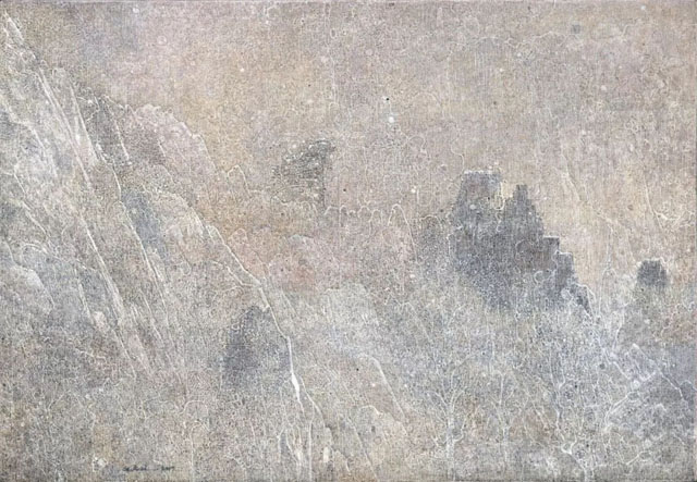
幽谷雪霽 Snow in Secluded Valley
2017, 90 x 130 cm
油彩布面 Oil on Canvas
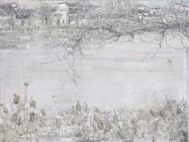
我沒問過郭凱,他的創(chuàng)作是否受過喬治.莫蘭迪的影響,這位來自意大利的灰色調(diào)大師善于把藍(lán)、橙、土黃等不同色彩滲入灰色里,證明自己對于灰色卓越的駕馭力。莫蘭迪一生孤寂而平凡,廝守著生活中的壇壇罐罐,因?yàn)榛疑{(diào)的運(yùn)用,所有靜物置放都達(dá)到視覺上的完美平衡,給人安靜、溫柔、體貼的精神慰藉,傳遞出寧靜和隱秘的氣息。郭凱同樣讓諸多色彩淡化在灰色里,失卻各自的明亮度,離異各自的純凈度,形成安逸而有些間隔的圖式,成全靜謐而帶有遐想的畫境,造就有形與無形交織、有聲與無聲互融的皖南民居的詩意之美。郭凱的油畫,不張不揚(yáng),不驚不乍,默默釋放出最樸實(shí)的震撼力和直逼內(nèi)心的優(yōu)雅。例如《秋木遠(yuǎn)聲》,青磚黛瓦馬頭墻在灰色中若隱若現(xiàn),不再黑白分明;秋天環(huán)繞民居的高低參差、遠(yuǎn)近錯落的樹木原本色彩鮮明,卻在灰化過程中成為灰綠、灰黃和灰紅的組合,不再五彩斑斕。
秋木遠(yuǎn)聲 Distant Sounds in Autumn Woods
2013, 100 x 100 cm
油彩布面 Oil on Canvas
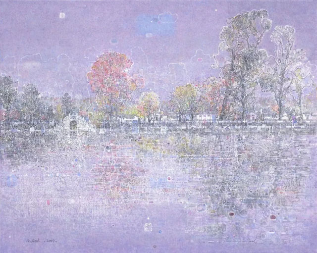
郭凱的畫作透視出灰色調(diào)的理念、放射出灰色調(diào)的魅力,因此被諸多評論為最能體現(xiàn)中國畫的審美追求。的確如此,當(dāng)灰色調(diào)統(tǒng)領(lǐng)畫面時(shí),光的明暗、色的冷暖、視覺的遠(yuǎn)近變化等,不再成為組合作品時(shí)最重要的元素;形體關(guān)系的準(zhǔn)確性、清晰度、質(zhì)量感等,也不再成為評估作品時(shí)最突出的依據(jù),而中國畫品評框架里常見的寫意思維,大幅提高了使用概率。有時(shí),郭凱讓灰色調(diào)與中國畫的典型符號相遇、相知,使得解讀起來刻意躲避國畫品評語言而不能。如《幽潭泛舟》的一葉扁舟在幽深的水面上飄動,不知所之,讓人聯(lián)想到唐代張志和《漁歌子》以來的漁隱主題。有舟必然有人,卻又看不清晰,小舟里傳出的無聲旋律,訴說著幽潭的空寂,與沉靜的流水混合成天籟般的交響。另如《靜碧閑荷》,仍然以灰色調(diào)為主,仍然是灰蒙蒙的村口水塘,大小的色階稍有區(qū)別的色塊零星散落水面,讓人聯(lián)想到八大、徐渭筆下的墨荷,散發(fā)著「出淤泥而不染,濯清漣而不妖」的幽香,然而,應(yīng)該與灰色調(diào)有關(guān),池塘上略嫌孤獨(dú)和清高的卷荷,連同過于安靜、近乎凝固的氣流,在散發(fā)幽香的同時(shí),感到幾分疏離。
幽潭泛舟 Sailing on a Secluded Lake
2013, 90 x 120 cm
油彩布面 Oil on Canvas
灰色調(diào)是矛盾的統(tǒng)一體,一方面具有內(nèi)涵豐富、啟發(fā)想象的潛質(zhì),另一方面,表面上呈現(xiàn)出來霧氣氤氳的單調(diào)感,需要畫家運(yùn)用精細(xì)的技術(shù)彌補(bǔ)。郭凱首先是思索肌理語言問題,在創(chuàng)作實(shí)踐中長期探索肌理效果的變化,致力于畫面質(zhì)感的豐滿,避免大面積涂抹灰色形成單調(diào)印象。例如《晨霧初開》、《蕭疏山遙》等,粗看是灰色迷蒙,細(xì)看局部則可發(fā)現(xiàn),與灰色相疊的材料紋理和筆觸起伏痕跡纖毫畢露。郭凱曾經(jīng)描述探索技術(shù)過程:「用松節(jié)油少量打底,皂化蠟增稠,混入礦物顏料及進(jìn)口粗砂塑型劑等豐富畫面表現(xiàn),局部用刀做出柔和的淺起伏肌理,半干時(shí)用大筆營造關(guān)系,小號筆深入部分局部。」
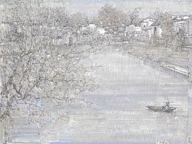
橋影NO.1 Reflection of the Bridge No. 1
2017, 80 x 100 cm
油彩布面 Oil on Canvas
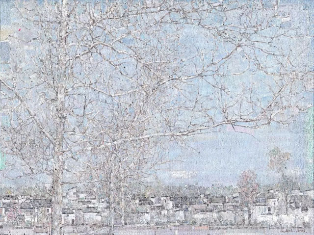
2013年以后,郭凱色彩處理有些變化:灰色調(diào)仍舊統(tǒng)攝全域,但其他對比色的灰化程度減弱,亮度和純度也有所提高。如《漫枝悄然》,鋪底的大面積藍(lán)色雖然灰灰的,但是不容混淆,映襯著黑白構(gòu)成的樹枝向四面八方伸展,迸發(fā)出不愿妥協(xié)的力量感。再如《檐邊秋意》,紅紅黃黃的色彩沒有淹沒在灰色中,而以足夠的亮度和純度向人們招手,顯示著果實(shí)滿樹,秋意正濃。又如《秋霧》,盡管是霧靄瀰漫的深秋,那些燦若桃花的粉紅色,以及成熟花果枝葉的黃色和藍(lán)色,已經(jīng)沖破迷霧籠罩,展示生生不息的生命力。去年以來的新作表明,郭凱在豐富畫面肌理和提高對比色的亮度、純度同時(shí)出擊,試圖進(jìn)一步制約整體灰色運(yùn)用造成的間隔效果,強(qiáng)化灰色調(diào)的觀賞性。就像《秋宅》、《白橋NO.2》等,多樣鮮活的色彩成為參與肌理變化的抽象語言,在灰色布局上跳動閃爍,把畫面裝點(diǎn)得更加生動。
檐邊秋意 Autumn by the Eaves
2013, 75 x 75 cm
油彩布面 Oil on Canvas
我以灰色的運(yùn)用為線索,對郭凱的油畫創(chuàng)作進(jìn)行兩階段梳理,從形而下的灰色塊到形而上的灰色調(diào),又從灰色調(diào)的初級版到灰色調(diào)的升華版。郭凱接下去會怎樣更有力地啟動灰色的靈性,拓展灰色的包容空間和表現(xiàn)力,值得關(guān)注并寄予厚望!
白橋NO.2 White Bridge No. 2
2017, 80 x 100 cm
油彩布面 Oil on Canvas
The Charm of Gray-Tone
Tang Yue/ Vice-President of CFLAC of Anhui Province
I have a feeling that Guo Kai’s paintings have become increasingly gray-toned.
I have not had the pleasure of knowing the Guo Kai of the last century, and have only a limited knowledge of his early works, such as works from Xiaoqi Village of Wuyuan County in 1993 and works created during his study at the China Central Academy of Fine Arts (CAFA) in 1996. According Yin Shuangxi’s assessment, Guo Kai’s works at that time were heavy in the use of color, and somewhat restrained and overly rational.
In terms of becoming increasingly gray-toned, it is in fact due to Guo Kai’s use of the color gray becoming executed with more control and freedom. The heavy use of color and restrained nature of Guo’s early works contrasts with the lightness and ease of his later works, but his use of color has never strictly followed the principles of Realism. For example, in Xiaoqi Village of 1993, the image is gray is tone, with a low sense of light and clarity, and filled with a quiet atmosphere. However, Guo Kai’s paintings have gone from a physical use of gray to a spiritual gray-tone expression. The use of gray-tone over an entire image creates a dreamlike and poetic quality, and is a matter of the Twenty-First Century for the artist.
The physical use of gray refers its use among a variety of colors, to illustrate the physical shape of an object. Furthermore, it is used in the contrast between light and dark. In terms of composition, it plays a role in the transition of colors, or in the contrast between cold and warm tones. This use of gray is still a technical matter. Although it has taken on a greater role than simply shading, it is nonetheless a pictorial device. The Guo Kai of the Twentieth Century was in period of exploration, not rigidly adhering to Realsim, but not yet breaking into the grounds of a personal Subjectivism. During this period, Guo’s use of gray was incomplete. On one hand, it enhanced the sense of personal style, as seen in Dawnof1993, while on the other hand, its purpose as a device for rendering shapes and objects was still clear, like his works during his time at CAFA. Since the Twenty-First Century, Guo Kai began pursing the essence of gray, and its intrinsic value. For him, the color became an artistic language bearing the artist’s spirit and emotions. On a visual level, the color gradually grew into an overall tone, which dictated the composition as a whole. As a result, Guo’s use of gray became a spiritual use of subjective expressionism.
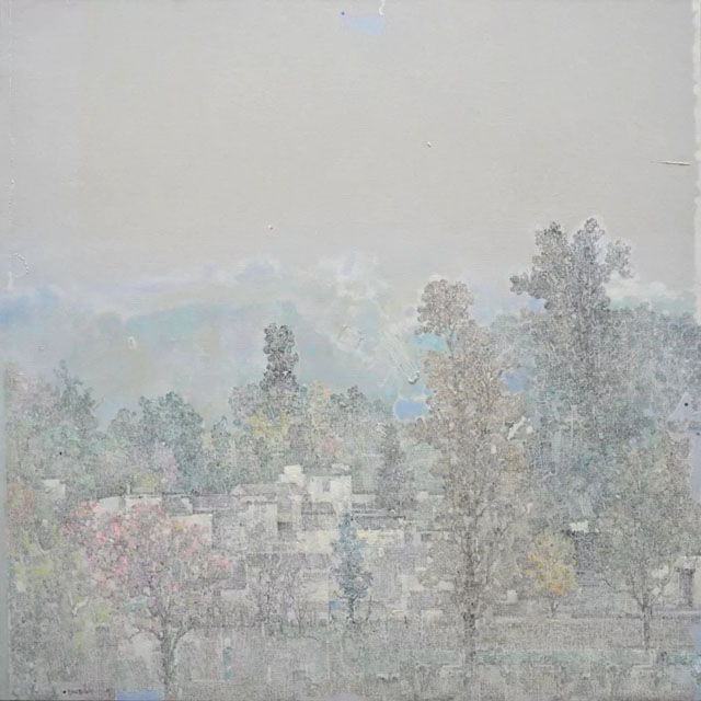
遠(yuǎn)村如煙 Misty Remote Village
2018, 90 x 130 cm
油彩布面 Oil on Canvas
Guo Kai’s early period of exploration with different colors is an indication of his search for direction. In terms of subject matter, Guo is already familiar with the historic buildings of southern Anhui Province. However, in representation, such as setting the color scheme, creating the emotional atmosphere, and choosing the mode of illustrating architecture, he displayed signs of uncertainty. Guo’s later decision and dedication to the gray-toned image is due to two reasons. Firstly, he had already developed a preference for the calm and composed nature of gray. In the Eye of the Target series, the background is largely set in gray, with a limited use of other colors, which symbolizes the mental composure and concentration of the archers when aiming at the target. However, the brighter treatment of colors on the figures seems to disconnect them from the gray background, in which a sense of compositional unity is lost. Secondly, and more importantly, after a period of exploration, Guo Kai has developed a deeper understanding of gray, especially the neutrality of the color. Existing between the extremes of black and white, gray reserves a certain degree of potential and uncertainty. Therefore, when Guo Kai faces the landscape of southern Anhui with personal thoughts and emotions, gray is the color of choice. Around 2010, Guo Kai’s style finally reached maturity. In Frosty Pines, Breezy Shadows, and Distant Sound of Pine, the surfaces of each painting appear to be covered in a sheet of gray. The overall tone is calm and composed, and allows the viewer to carefully search through the painting for old trees, distant mountains, and the villages nestled within. Although the image is with human figures, both the artist and viewer are invited into the painting, to converse with the natural scenery.
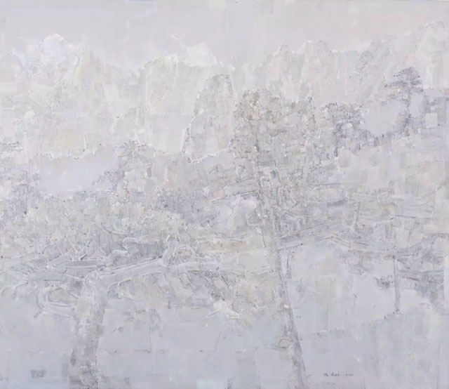
遠(yuǎn)嶺松聲 The Sound of Pine from a Distant Ridge
2014, 130 x 150 cm
油彩布面 Oil on Canvas
I have not asked Guo Kai, if his art has been influenced by Giorgio Morandi (1894 - 1964), the Italian painter, who brilliantly mixes blue, orange, and beige into his gray compositions. Morandi led an ordinary and lonely life, and painted exclusively still life paintings of bottles. Because of his use of gray, Morandi’s still life paintings gave a sense of calmness, warmth, and comfort. Similarly, Guo Kai also mixes muted colors into his gray. Leaving behind the brightness and the distinctness of individual colors, Guo achieves harmonious distribution of colors within an overall spectrum of gray. Without strong colors to outline the contours of figures, the subjects within his paintings linger between figurative form and formless abstraction, as poetic allusions to the scenery in which they exist. Seemingly bland at first sight, the emotional depths of Guo Kai’s paintings are revealed subtly and quietly. In Distant Sounds in Autumn Woods, the tiles of the sloping roof of the building are hidden in a sea of gray, and are one with its natural surroundings. The bright autumn colors of the trees are diluted in the gray-tone, becoming pale greens and yellows.
靜碧閒荷 Tranquil Lotus Bed
2013, 90 x 120 cm
油彩布面 Oil on Canvas
Guo Kai’s art expresses the philosophy and charm of the gray-tone, and has therefore been understood as a search for traditional Chinese aesthetics. Indeed, when gray-tone dominate an image, the value of light, the warmth of colors, the use of perspective, are no longer the most important elements in the composition, and the accurate rendering of physical shapes, in terms of figurative representation, is no longer the most determine factor in assessing an artwork. In the framework of traditional Chinese painting, the emotion conveyed is most valued. Many traditional Chinese painting motifs can be found in Guo Kai’s paintings, in which they hold the same symbolism as in the traditional canon. Therefore in appreciating his art, a traditional approach is not without merit. In Sailing on a Secluded Lake, a small boat is depicted on a lake, which is reminiscent of the traditional motif of a fisherman, which symbolizes reclusion and freedom from the mundane nature of daily life. Although the boat is present, the presence of the fisherman is only implied. The boat itself is without action or movement, completely still inside the painting. In Tranquil Lotus Bed, also set in gray-tone, the subject is a lotus pound in front of a rural village. The limited use of colors on the withered lotus brings to mind the famous ink renditions of lotus by Bada Shanren (1626 - 1705), in which different tonalities of ink and wash fully and vividly render the elegant shape of the leaves.
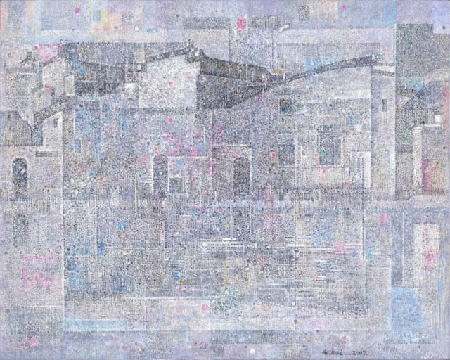
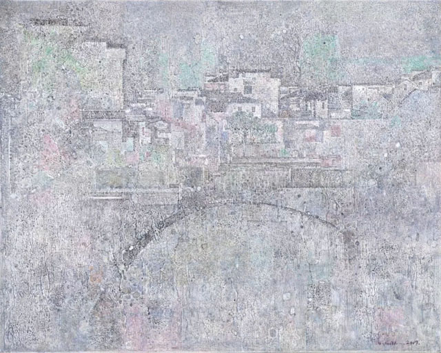
宅構(gòu) Homestead
2007, 80 x 100 cm
油彩布面 Oil on Canvas
Gray monochrome itself is a contradiction, in the sense that, on one hand, the neutrality of the color is full of visual potential and leaves room to the imagination, while on the other hand; the bland and monotonous nature of the color truly demands the talent of the artist. Firstly, Guo Kai is concerned with the surface texture of the painting, and has long explored the various applications of texture. His goal is to create sculptural qualities to his painted canvas, while avoiding smearing excess paint in a crude fashion. A close inspection of Early Morning Mist and Distant Mountain reveals faint sculptural patterns in the gray paint, in which the movements of the brush can be detected. Guo Kai has described his practice of “making a light base with turpentine, and mixing with saponified wax, color pigment, and molding paste for the paint. In certain parts, the painter’s knife sculpts the applied paint before it has completely dried.”
漫枝悄然 Blooming Branches
2013, 90 x 120 cm
油彩布面 Oil on Canvas
Since 2013, Guo Kai’s use of colors when through another change. While gray dominates the overall composition, his other colors are less diluted by gray and have retained their brightness and individuality. In Blooming Branches, the background is largely set in a bluish-gray, but it does not conflict with the crisscrossing black and white branches of the foreground, instead it reinforces the vitality of the branches. In Autumn by the Eaves, the autumn colors of red and yellow are not submerged within the gray, but instead stand out to the viewer, strongly signifying the mood of the season. Also in Autumn Mist, even in rainy and misty autumn weather, brightly colored leaves pierce through the fog, full of life. In his representative works form last year, the textures have taken a more sculptural quality and the complimentary colors have become brighter and more distinct, thereby bringing his paintings into a more advanced application and appreciation of the gray-tone. In Autumn Estate and White Bridge No. 2, the brighter colors have taken on a more abstract quality in the image, seemingly floating above the gray composition with a sense of excitement and movement.

秋宅 Autumn Estate
2016, 30 x 40 cm x 2
油彩布面 Oil on Canvas
Taking the use of gray-tone as an approach, Guo Kai’s art is analyzed from two stages, from a pictorial use of the color to a more spiritual use, and also from an early period of exploration to a mature and developed style. Where Guo Kai will take this use of gray, in terms of the colors neutrality and expressiveness, is worth considering and waiting for.
郭 凱 - 清風(fēng)遠(yuǎn)逸
國父紀(jì)念館個展
GUO KAI - Faraway Breeze
Solo Exhibition at Sun Yat-sen Memorial Hall
展覽日期 Date: 2018.9.15 - 24
開幕時(shí)間 Reception: 2018.9.15 週六 Sat 3:00 pm
開放時(shí)間 Hours: 9:00 am - 6:00 pm
展出地點(diǎn) Venue: 國父紀(jì)念館 文華軒(二樓川堂)
- 臺北市信義區(qū)仁愛路四段五零五號
Wenhua Gallery, 2F, Sun Yat-sen Memorial Hall
- No 505, Sec 4, Renai Rd, Xinyi Dist, Taipei
 皖公網(wǎng)安備 34010402700602號